Showing posts with label behind the scenes. Show all posts

Sunday, June 30, 2013

Behind the Scenes: My Life Verse


 {art available here}


{art available here}


{art available here}

As promised from my previous post, a peek inside my personal life verse. I have created it in 2 styles: both my vintage style & Words to Move You {subway art with an elegant twist} style. 

The entire prayer by Paul for the church of Ephesus sums up the best parts of life: to truly KNOW the love of God {ie: feel it in your heart; experience it day by day; allow it to sink in to the depths of your soul & satisfy you} & to give Him glory {to Him who is able to do immeasurably more than we can even ask or imagine! THIS is our God!}

For my vintage style photography, I chose to photograph the branches of trees as they are ultimately rooted & intricate creating beautiful shapes & lines. I looked up & through the branches to also emphasize the vast sky & opening above of the limitless love which is from Heaven & so large.

For my subway style art, I chose red for the piece speaking of God's love & simplified the wording to get to the one of the major points of the passage. For the art speaking of God's glory I chose blue to symbolize the sky as in other passages it states that the heavens declare the glory of God & I personally often think of the beautiful wide skies. {but you can pick ANY color of art your heart desires!}

We have used this Scripture at our wedding & all 3 of our children's baby dedications. If we experience the love of God in our marriage & if our children accept and understand the love of God in their own lives, well.... what could be better than that?!

Grace & Peace,
Julie

Tuesday, June 25, 2013

Behind the Scenes: You are Loved

{Art reads: YOU ARE LOVED more than you'll ever know}

There is a Savior, a Redeemer who loves you more than you'll ever know.

Not only is it difficult for us to understand the true depth of His love, even more than that, it is often hard for us to accept it.

{Art available here}

I created this piece not only to be a reminder of truth for my children {both to declare my love for them, but more importantly, God's love for them!}, but also a reminder for me.

My life verse is Ephesians 3:14-21 : Paul's prayer for the church of Ephesus that they would KNOW the love of Christ. Feel it. Experience it. Revel in it.

I hope you know it too and receive it for yourself! Allow His love to fill you!

Grace & Peace,
Julie

Sunday, May 26, 2013

The Evolution of Design Style throughout Life Verse Design {thus far!}

 I just realized I never followed up on my statement to show you all the evolution process of my Life Verse Design style & how on earth it has transformed from vintage sepia tone, classic photography & design into bold, contemporary subway style typography.

I hope you enjoy the behind the scenes of a designer's mind!

In 2007 I began Life Verse Design by creating a body of work that is available in either sepia tone or black & white photography. I did this for a few reasons:

1. I wanted my work to be timeless & withstand long term home design. You know, a piece that would look gorgeous & not out-dated or trendy.

2. I wanted to create a body of work that had continuity that color photography could not offer. With my varied subject matter of the images {from baby feet to mountains}, I wanted to make sure that any image would still remain a part of the body of work & there would be an immediate "look & feel" to my line.

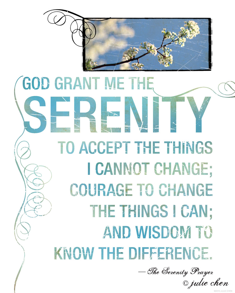
I first created full bleed images in which the text would overlay & interact with the imagery & elegant embellishments or scroll work. The photo was purposely meant to be seen first, and the text secondary as I wanted the viewer to come close, be intimate with the words & really meditate on them. I also used layers of textures & scratches to again emphasize the vintage & timeless feel of the art.


 I then started insetting the image into a vintage photo box surrounded by the beautiful scrolls & the text became more separate & simplified. A meditative & elegant feel remained, as simplicity reined.


 In 2008 I designed the above book, Red, White & Blue for Tyndale House Publishers. Since I LOVE textures, I decided to roughen up this political thriller with my scratches & yet soften the bold san serif typography with the embellishments since it was a book about a female presidential candidate.

At the same time, my big kids kept telling me, "Mom, you need more color in your art! Why is everything brown?!"

 So, I decided to do just that: combining the inset vintage photo frame edge, I could separate image from text & choose any palette I desired. I created an entire series of contemporary pieces for Demdaco, as I had presented my concept to them & they asked me to create a color line of art cards {which were never produced}. You will see my key elements of scratches & embellishments remain to continue the vintage tie. But now, after working on several contemporary book covers & using LOTS of bold, san serif fonts, I thought this was pretty fun to switch the emphasis from viewing the photo first & text second, to viewing the text first & photo second.


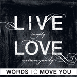
Then came the problem of wanting to create several really powerful quotes that I did not see "marry" an image. {You see, my imagery always has a purpose to the quote: it is never simply eye candy or a pretty picture...} Plus, I wanted to start reaching a different audience: men for one thing + customers who have a more modern style feel. I continued to play with the bold typography & let the quote speak for itself. I could not get rid of the textures though, as I am a texture girl at heart. So, I worked with my oil pastel backgrounds & created an all new color palette that the customer could choose themselves to fit their home decore needs. I dropped the photography all together, and yet kept the swirls as it makes the type move & the scratches which still give it a timeless quality to it. So, this line is my "Words to Move You" : subway art with an elegant twist.

Thanks for reading! I hope you enjoyed a peek into my brain.

OH & you can see in this post the 3 versions of The Serenity Prayer I offer... how different & yet how similar they are. Which one would you prefer?

Grace & Peace,
Julie

Monday, April 15, 2013

Behind the Scenes: How my book design with Tyndale has influenced my art

I have been wanting to write a post about the evolution of my work, especially as it relates to how my vintage style sepia work has transitioned into my new Words to Move You line. On the surface they are very different. But, key elements of my work remain: depth of textures, scratches to make it look weathered & timeless and the embellishments I just cannot live without.

In thinking through the transitions, it brought me back to my work as a book designer for Tyndale House Publishers. Over many years have I been "dressing up" or embellishing text. The first book I did this on was Max Lucado's "Shaped by God" in which I created small bits of elegance in the "A's". (I think I designed this book around 2001.)

On the NLT Holy Bible (this was a new edition showcasing the new NLT logo) I add movement to the "H" & "E" allowing for your eye to flow through the title.

 On the cover of The One Year Devotions for Moms, you will notice *many* of my art elements!

 On the cover of Red, White, and Blue (a political fiction cover I designed) I introduce the bold san serif typography combined with scratches & embellishments.

 On the cover of Butterfly in Brazil (love this cover btw), I combine the swirlies with the script font used in my vintage style art.


 Both Hurricanes in Paradise & Craving Grace combine the swirls with the san serif!


Next post, I will show more evolution of my art process.

OH & btw: FREE shipping in both shops ends tomorrow! Enter coupon code SPRING2013 at checkout. Enjoy!

Grace & Peace,
Julie

Thursday, April 4, 2013

Behind the Scenes: Count Your Blessings

 {art available here}

I created this art a few years ago now & it has spoken to my heart many times this year. Since I have 3 little ones, I chose to photograph 3 {fake} eggs in a real robin's nest {it had fallen out of a tree & is now one of my treasures}. It is simply symbolic of what a blessing family is in my life, what my personal little nest is filled with. Or it could be symbolic of any treasure in your nest that you can count daily.

 {photo by Ann Voskamp}

While at the Atlanta Gift Show in January of 2011, I was showing my art to a DaySpring buyer & he pulled out this book in response to my nest art! Wow, do I wish I created that cover! I love it.

In any case, I finally read the book along with my bible study this year & as usual, God's timing is perfect.

At the end of 2012, my 2 licensing contracts ended: one with Demdaco (my plaques & crosses) & one with Avalanche Publishing (the sister company of Lang who produced my calendars). I knew those licenses would not last forever, but I have noticed this year more doubt in my heart and feelings of not being "good enough" in response to those "successes" ending. It drives me crazy, as for one, those business deals were TOTALLY God's grace in the first place! (I did not even seek out to be licensed with Demdaco & would have never even dreamt that big!) And, I began this entire art form as a personal act of worship & to encourage others, not to gain worldly success (& yet my heart battles with this now).


Recently I was having "one of those days" in which I was bummed about lack of sales all the while comparing myself to other artists who are much bigger than I & at bed time one of my kiddos shared how they did not feel like they were good enough at something at school. I in turn told them how I felt the same way about myself & felt that I was not a good enough artist, to which the older 2 stopped, gasped, and yelled, "WHAT?! MOMMY, YOU ARE THE BEST ARTIST IN THE WORLD! THE BEST ONE I HAVE EVER KNOWN!"

Be still my beating heart.

I mean, seriously folks, what is better than being the best in the eyes of your children who exclaimed those words with such sincerity of heart!

I got out my gratitude journal & started the list. God has used Ann's book in my life to show me so many things: about finding joy through thanksgiving, be grateful for what you DO have & not dwelling on what you don't have, seeing Him work in the midst of your days even in your ugly beautiful moments, and most of all living fully in His grace.

I am so blessed in so many ways & so humbled that God would choose this life for me. I hope all of you grow in gratitude so that you can be full of joy.

Grace & Peace,
Julie

Monday, October 29, 2012

New Product! Introducing The Vintage Alphabet

I am so pleased to introduce my NEW Vintage Alphabet line!


 Also available here as custom made monogram note cards which will make a great Christmas gift for teachers, coworkers, friends, family, etc...

Here is the story behind my vintage style Life Verse Design letters:

While pregnant with my favorite little mister, I had drew & painted my animal alphabet for his nursery. Based on the classic & timeless font Palatino, I had the animals somehow interact with the letters in my watercolor & pen & ink style.

Since having kids & doing more work digitally, I thought of creating a new alphabet, but this time in my Life Verse Design style.

I hope you enjoy it! The ideas are endless.

As an introductory offer, between now & 11.03.12 I am offering FREE shipping on any Vintage Alphabet purchase! Just enter the code: Alphabet

Grace & Peace,
Julie

Thursday, September 27, 2012

Behind the Scenes: Website Images for www.lifeversedesign.com {which REALLY IS in the works!}


Yesterday I spent the bulk of the day photographing my products in a beautiful state park here in the midwest. I am SO happy with the images, I thought I would give you all a sneak peek for what is coming! I have been making further progress on my own website (which I will use in addition to ETSY) & I hope to have it done by the end of the year... which would be a true miracle, as I started this well over a year ago.

A special shout out to my friends who helped me think through props & how to style the shoot:

the magnificent Sugar Cookie Lady who is an expert in antiques — please see her shop here.

the beautiful Lauren of Lauren Wave Weddings & Events who found the great location & sacrificed her day to my benefit.

Thank you ladies. I am forever grateful that you would take part in my art endeavors!

OK, off to edit more images & get them ready for a real, live website!

Grace & Peace,
Julie

Thursday, September 20, 2012

Behnind the Scenes: Fear Not, for I am With You


This past week has felt like an emotional roller coaster for me. Many things hit at once, and yet all pretty small in comparison to those loved ones around me. My hubby, the nurse, witnessed his first patient die right before his eyes. One friend whose house burned half way last spring also has watched her hubby go through major surgery over the last several weeks. Another friend is a single mother who cares relentlessly for her 2 toddlers, one of which is severely handicapped & it is a true miracle if she ever gets to sleep through the night even {I think it's God's provision that she is a nurse}. 
And, as for my new & dear bible study, well, pretty much we are all a masterpiece in the making going through our own fires and floods.


My 2 friends I mentioned above had actually told me separately how much this passage from Isaiah has gotten them through their trials, so this morning instead of doing "work", I decided to create art to encourage their hearts & hopefully help them to press on and see God's great love for them and the fact that He truly is their Savior and Lord, carrying them through the flames and fire.


{Art available here}

I chose the waterfall image which I shot in Colorado a few years ago, just thinking of the power of water. Water can be so calming, cleansing & soothing and then as it piles up in its mighty force, it is actually dangerous. When we are walking through our trials, we can feel so overwhelmed and flooded with the situation surrounding us. But God is there, mighty to save, present, strong & loving.

I also love how the passage speaks of how He has "summoned us by name. You are MINE."

And, sad to say, it is not "if" you walk through the fire, but "when". Hardship is a part of this lifetime, yet He is with us to carry us through.

May you know His love, strength, and grace today.

Grace & Peace,
Julie

Tuesday, June 5, 2012

Behind the Scenes: Psalm 145: Praise!


Every day I will praise you and extol your name for ever and ever.
Great is the Lord and most worthy of praise; 
his greatness no one can fathom.
Psalm 145:2-3

When thinking of how I could visually design this psalm, I focused on the first line over & over, "every day I will praise you & extol your name for ever & ever..." I thought about the joyful emotions experienced while I worship my Lord, as well as a natural element that points heavenward. I chose a sunflower, as they are bright & cheery & "turn" to face the sun, their true source of light & life. I wanted the image to be upbeat & beautiful, drawing others into worship themselves.

Worship, whether it be through song, prayer, service, art, writing, etc... is such a personal event as you connect your heart with your creator's. I hope you experience hope, joy, and abundance of life as you enter in and that it is done with all of your heart, soul, mind, and strength. With that said, I also know there are seasons of life in which worship is purely a choice & according to the Psalms, a sacrifice of praise. Either way, whether we fully "feel" like it or not, He is worthy of all praise and I hope you sense His pleasure and Spirit as you give your pure worship to Him.

{art available here}

May you enjoy serving & worshiping our mighty God.

grace & peace,
julie

Monday, February 27, 2012

Behind the Scenes: Always?!


{art available here}


{art available here}

My Bible study recently completed the book of Philippians. What a beautiful, encouraging & challenging book! One verse that always "gets me" though is in chapter 4: Rejoice in the Lord always! AGAIN, I WILL SAY IT: REJOICE! {hmm... now why do you think Paul needed to repeat himself? probably just for me!}

Always? really God?

The same day I found out a dear friend had a miscarriage & immediately I thought of this verse that is one of those "Christiany" verses that many so flippantly say, "Well, PRAISE the LORD!" "Rejoice always!" "Hallelujah!"

I did NOT feel like rejoicing. Instead, I wept. I remembered the pain of loss. The empty feeling. The "why's" & "what did I do wrong?"

You see, in difficult times I am {often} able to have faith, hope & trust but joy? hmm.. I am still trying to figure that whole thing out.

The next morning (in the shower of course... my alone time :) God pointed out to me the 2 key words I was looking over: IN THE. You see, He is not asking us to rejoice in our situation or our circumstance, but no! Rather, we can really truly always rejoice IN HIM. In who He is & what He has done & is able to do. Even in the midst of sorrow, there is always something to rejoice in: Jesus & the hope we have in Him alone. Our Heavenly Father who is constantly reaching out to us. The Holy Spirit who is able to fill us with the peace that passes understanding & yes, even joy. And it is not making light of our pain & sorrows that we may be facing currently in our lives. {we are also called to mourn with those who mourn}

I pray He continues to grow in me a heart of rejoicing IN HIM, keeping my eyes heavenward knowing that there is truly always something to rejoice in. And, quite honestly, I still think it is funny that Paul had to repeat himself as it shows that people like me needed to hear it over & over again. {read the book of Philippians & highlight how many times Paul writes "joy" or "rejoice" & take note of what or why he is rejoicing! a fun little word study! now GO!}

grace & peace,
julie

Monday, January 30, 2012

Behind the Scenes: Be Like Christ


{art available here}
cross photo copyright Slavomir Ulicny used by permission


I am currently studying the book of Philippians, one of my all time favorites right up there with Ephesians and Colossians and John and .... well... too many to list...

In any case, I am being greatly encouraged and challenged. We just finished chapter 2 and I was thinking of how I have visually illustrated several of the key Philippians passages already (more to come!)

This particular piece I originally created for my hubby's cousin's wife. I chose to show the cross here, even though I often try to use more illustrative images (other than the obvious "Christian" symbols). But, for this particular passage part of the power of it is the culmination of Jesus' extreme humility and obedience, resulting in His death on the cross. What could be more powerful of an image than the cross to show this laying down of His life.

In studying it again, I can only say Lord help me to even begin to do this in my own life. May your Spirit fill me so that I truly love others as you did: by putting them first and pointing them toward the Heavenly Father.

Grace & Peace,
Julie

Friday, November 18, 2011

Behind the Scenes: This is the Day

This is the day the LORD has made;
let us rejoice and be glad in it.
—Psalm 118: 24 NIV

{art available here}

This art was actually inspired by my egg carton. On the inside of the lid, the Psalm is written so that every day when people all over the USA open their carton they can be reminded of God's truth. {How cool is that?}

I of course had visions of a rooster perched on a fence post with a majestic sky in the background for my photography. I went to a friend's "farm" who has a chicken coop & she totally laughed at me. I think her exact words were, "Good luck with THAT!" I could not even get a descent image of her crazy, active chickens at all.

Fast forward to the fall, when we took our annual family trip to Edwards Apple Orchard in Poplar Grove, IL. I have been coming her since I was a child, and now every year we celebrate pumpkin-poo's birthday there as it falls at that time of year. We were feeding the animals and low & behold, I got the shot!

Here is the black and white version of the art. I think it is so fun to have this in a kitchen! My kitchen actually has 2 cupboards in which the previous owner took out the glass and replaced it with chicken wire to display her antique rooster / chicken collection!

Oh, how fun it would be to see my art in Egg Harbor Cafe too!

OK, back to the story. Here is one of my new favorite family photos,
shot by my dad in the orchard.

Pumkin-Poos!

Sunshine Girl!
My Favorite Little Mister!
{who is getting a bit tired of Mommy's photo taking}

{Art available here}

And, last by not least, of course I had to shoot a bucket of apples. YUM.

I hope you are rejoicing on this day that our Lord has made!

Grace & Peace,
Julie