I have been wanting to write a post about the evolution of my work, especially as it relates to how my
vintage style sepia work has transitioned into my new
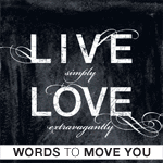
Words to Move You line. On the surface they are very different. But, key elements of my work remain: depth of textures, scratches to make it look weathered & timeless and the embellishments I just cannot live without.
In thinking through the transitions, it brought me back to my work as a book designer for
Tyndale House Publishers. Over many years have I been "dressing up" or embellishing text. The first book I did this on was Max Lucado's "Shaped by God" in which I created small bits of elegance in the "A's". (I think I designed this book around 2001.)
On the NLT Holy Bible (this was a new edition showcasing the new NLT logo) I add movement to the "H" & "E" allowing for your eye to flow through the title.
On the cover of The One Year Devotions for Moms, you will notice *many* of my art elements!
On the cover of Red, White, and Blue (a political fiction cover I designed) I introduce the bold san serif typography combined with scratches & embellishments.
On the cover of Butterfly in Brazil (love this cover btw), I combine the swirlies with the script font used in my vintage style art.
Both Hurricanes in Paradise & Craving Grace combine the swirls with the san serif!
Next post, I will show more evolution of my art process.
OH & btw: FREE shipping in both shops ends tomorrow! Enter coupon code SPRING2013 at checkout. Enjoy!
Grace & Peace,
Julie


No comments:
Post a Comment